Where Your Eye Lands First: Reading the Weight of a Painting
Read the visual weight of a painting by comparing contrast, placement and scale, so you can see why some areas attract attention and others recede.
The common mistake in reading the visual weight of a painting is to assume the largest or brightest feature must matter most. That shortcut can make the composition seem simpler than it is, because a tiny sharp mark may command attention while a broad pale area barely registers. Visual weight is a way to describe how strongly parts of an image attract or hold your gaze.
Here, “pull” means the noticeable tendency for your eyes to land on or return to an area. An empty patch has no pull simply because it is empty; it can feel prominent when its size, shape or contrast with nearby marks makes you notice the space itself. Think of a quiet patch as a pause between notes: it shapes the experience without acting like another loud note.
Notice the first pull
Stand at a comfortable distance and look at the painting as a whole. Let your first glance settle without trying to identify a story. You might notice a pale sleeve against a dark wall, a hard-edged window or a dense knot of brushwork.
Describe the feature precisely enough to picture it again: “the small red patch near the lower left stands out against muted grey” is more useful than “the red”. The point is not to build an interpretation from clues, but to notice how the image distributes attention across its surface.
Now turn away briefly and look back. If your gaze returns to the same area, it may have a persistent pull for you. If it lands elsewhere, that does not invalidate the first glance; it shows that attention can shift with posture, distance, lighting or mood.
Compare visual signals
Contrast is one source of visual weight. Light against dark is easy to spot, but a crisp edge among blurred forms, a rough patch among smooth paint, or a crowded area beside a sparse one can also stand out. Ask what changes between neighbouring passages: value, hue, edge, texture or detail.
Brightness alone is a poor ranking system. A yellow shape against white may blend in, while a modest grey shape edged with deep brown can catch the eye. Compare each feature with its surroundings rather than judging it in isolation.
Distance changes what you notice. From across a gallery, broad light and dark masses may dominate; closer up, small colour shifts or scumbled brushwork can become more apparent. Neither view is the single correct one. They reveal different scales of activity in the painting.
Consider position and space
A shape’s location affects its relationship with the rest of the composition. A dark form near an edge may make that side feel anchored; a small bright mark near the centre may attract a quick glance. Neither outcome follows a fixed rule, because neighbouring shapes and open areas alter the effect.
Look loosely at left and right, top and bottom. Which area feels crowded? Where does the painting leave room? Is a strong shape close to an edge, or surrounded by space? These questions help you describe the arrangement without imposing a rigid grid.
Balance is not the same as symmetry. Imagine a seesaw: a small child near the pivot can balance a heavier person farther away. In a painting, a compact, high-contrast shape may counter a broad, softly painted mass. The useful question is how the parts relate, not whether both halves match.
Lines and edges can also shape attention. A sloping roofline, an arm or a band of colour may carry your gaze across the canvas. If a form points towards the frame, your attention may move outward; a curve that turns back into the scene can keep it within the composition.
Follow the composition’s rhythm
Rather than mapping a single route for your eyes, notice how the painting varies its pace. Repeated colours or shapes can make separate areas feel connected; a sharp mark can interrupt a quieter passage. An open, lightly worked area may let your attention pause, while a cluster of edges and details can make it linger.
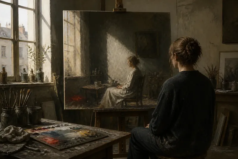
Say you are looking at an invented painting of a person seated beside a window. The starting point is a bright window frame; a diagonal shadow then points towards the person’s hand, where a small patch of colour catches attention. You follow those features in that order, and the observable result is a simple account of how the composition guides your gaze, not a conclusion about the person’s mood.
To explore the rhythm further, look at a corner you had overlooked. Notice whether repeated marks connect it to a busier area, or whether a change in texture makes it feel separate. This approach keeps the focus on the painting’s visual organisation rather than on decoding a hidden message.
Questions about visual weight?
Does the brightest area always lead?
No. A bright area may blend into its background, while a dark edge, unusual texture or isolated shape attracts more attention. Compare the feature with its immediate surroundings.
Can a small detail outweigh a large shape?
Yes. A small mark with a sharp edge or strong colour contrast can stand out against a broad, quiet form. Its position also matters: a mark at the end of a diagonal may be especially noticeable.
What if my attention keeps shifting?
Several features may be competing, or your attention may change as you move closer or farther away. Notice which qualities differ between them, such as edge, texture or colour, rather than forcing the painting into one focal point.
Does empty space have visual weight?
Space does not attract attention just by being empty. Its outline, size and contrast with nearby forms can make it a noticeable part of the composition, much as the gap between words helps separate them.
Keep a clear record
A short note can preserve what you noticed without turning it into a judgement: “The sharpest edges gather in the upper right; a diagonal leads towards the figure; the lower left is open.” That records the painting’s arrangement, rather than claiming what the artist intended or what the scene must mean.
Reading the visual weight of a painting is most useful when it helps you notice choices of scale, contrast and spacing that might otherwise pass unnoticed. Next time you look, compare one quiet area with one busy one: the difference can reveal how the composition makes room for both activity and rest.