Choosing a Watercolour Paper Surface for the Marks You Want
Watercolour paper surface shapes lines, washes and edges. Learn how to compare smooth and textured sheets and choose one that suits your next painting.
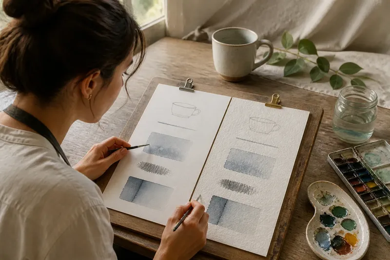
The common mistake with watercolour paper is choosing a sheet for its attractive grain, then finding that a fine line catches or a wash looks unlike the one you imagined. The cost is a frustrating start: the paper’s surface affects how your pencil and brush meet it. Choosing a watercolour paper surface by the marks you want to make is a more useful starting point.
Imagine Mina, a beginner planning an invented study of a ceramic cup, a few leaves and their shadow on a table. She wants a clear rim and a loose wash behind the cup. This is a hypothetical situation, not a report of a real painting. Comparing smoother and more textured sheets can help her decide which surface better suits each passage.
Start with marks
Watercolour paper ranges from relatively smooth to visibly textured. The common labels are hot-pressed, cold-pressed and rough, though surface character varies by maker and product. Think of the surface like the teeth of a comb: close, fine teeth meet a line differently from broad, irregular ones. The comparison is about contact, not about paper behaving like a comb in every other way.
On smoother paper, a pencil or fine brush may travel over a more even plane. That often suits outlines, small details and controlled passages. On textured paper, the raised areas can interrupt contact with a tool. A dry brush may leave broken touches; a wash may appear more varied where water and pigment collect, but this is not a predictable result on every sheet or in every painting condition. Brush loading, paper dampness and pigment all affect what happens.
Neither surface is inherently better. Ask which one makes the marks you want easier to attempt, rather than which paper is best in general.
Smooth paper trade-offs
Mina wants to draw the cup’s rim as a slender contour she can adjust. A smoother sheet has less pronounced texture beneath the pencil, so a light line may be less interrupted by bumps. It can also offer a relatively even path for a fine brush and a narrow painted edge.
That control has a trade-off. A fluid wash on smooth paper may move readily, and its edge can look sharp beside a dry area. If Mina wants a soft transition behind the cup, she will need to pay attention to how wet the paper and brush are. Smooth paper can make a crisp boundary easier to see, but it does not create a soft one automatically.
There is also less texture to disguise a hesitant line. A small wobble may remain visible, which can help Mina notice and refine her drawing, but may feel unforgiving if she expects the paper to soften every mark. A small pencil study can help her judge that quality before she begins the full painting.
Textured paper trade-offs
On a more textured sheet, Mina’s cup contour may look less uniformly crisp, particularly if her pencil mark is light or the point is fine. A broader pencil stroke can touch the raised areas and leave a broken line. If she wants a very clean outline, she may prefer a smoother surface or accept a less exact edge.
Texture can contribute variation to a wash, but the effect depends on the paper and how Mina paints. Colour may collect unevenly, and a lightly loaded brush may skip across raised areas. Those marks might suit loose leaf shapes or a broken shadow; they might also interrupt the quiet, even background she has in mind.
Texture is not simply “for expressive work”. It is a visible part of the image, and its character may support one passage while competing with another. Mina can choose based on the drawing as well as the painting: a clean cup shape may favour a smoother line, while broken leaf marks may welcome more surface texture.
Edges and washes
Watercolour edges range from crisp to soft, and paper surface is only one influence. Brush loading, the dampness of the sheet and the timing of a stroke also matter. A smoother surface may make uninterrupted contact easier for a fine brush, while texture can break a stroke if the brush rides over raised areas. Neither outcome is fixed: a well-loaded brush can make a continuous mark on textured paper, and a light touch can make an uneven one on smooth paper.
For Mina’s shadow, a soft edge might help the cup feel settled on the table. If she paints one wet area beside another, the colours may mingle; beside dry paper, a boundary may remain more distinct. Texture can make that boundary look irregular, while a smoother surface may make it appear more even. She should consider the intended edge, then treat water and timing as separate choices.
Surface is distinct from paper weight and construction. Smooth or textured sheets can also differ in how they handle moisture, buckling and repeated wet passages. Mina can compare surface feel first, then check the product label and maker’s guidance for suitability with watercolour and her intended use.
Compare sample marks
Before committing to a full painting, Mina can use offcuts or a sample pad. On each surface, she makes the same short pencil curve, paints a thin line with a fine brush and adds a small wash beside a dry patch. The aim is not to score the papers or predict every future painting. It is to notice which surface makes her intended marks easier to read and repeat.
- Check the pencil curve. If the light outline stays legible, decide whether its clarity suits the drawing; if texture interrupts it, choose a firmer or broader mark, or try a smoother sheet.
- Check the fine brush line. If it travels cleanly enough for the cup rim, keep that surface in consideration; if it skips, try a broader brush or choose a smoother surface if a continuous line matters.
- Check the small wash. If its variation suits the background, keep the textured sheet in consideration; if it looks uneven when you want a quiet passage, try a smoother sheet or adjust the water and brush loading.
- Check a dry-brush touch. If it breaks over the raised areas in a way that suits the leaves, use that effect there; if it distracts, use a lighter touch or choose a smoother surface.
- Check the edge beside dry paper. If it looks crisp enough for the cup, keep that surface for the outline; if the edge appears too irregular, try a smoother sheet or change how you place the wash.
- Check the product label. If the maker identifies the sheet as suitable for your intended watercolour use, consider it for the comparison; if the guidance does not fit, choose a product whose stated use does.
Say Mina uses two sample surfaces and the same brush and colours on each. On the smoother sheet, her pencil outline and fine rim line stay easy to follow, but the background edge looks sharper than she wants. On the textured sheet, the leaf strokes break pleasantly while the cup outline seems less tidy. She chooses the smoother sheet for the cup and plans to soften the background by adjusting the wetness and timing of her wash; she keeps the textured sheet in mind for studies where broken leaf marks matter more. These invented observations give her a working choice, not proof that either surface is right for everyone.
Questions about surfaces?
Is smooth paper easier for beginners?
It can make pencil outlines and fine brush marks easier to see because the surface is relatively even. It may also make hesitant lines and abrupt wash edges more visible, so “easier” depends on the marks you want to practise.
Does textured paper make painting look more expressive?
Texture can add visible variation when a brush skips or colour collects unevenly, but texture alone does not make an image convincing. It helps when broken marks support the subject and distracts when you want a quiet, uniform passage.
Can I draw on watercolour paper?
Yes, many artists sketch on it before painting, though pencil marks may show differently on smooth and textured surfaces. Keep the drawing light if you expect to paint over it, and try the pencil first if line visibility matters.
Should I choose hot-pressed or cold-pressed paper?
Hot-pressed paper is generally associated with a smoother surface, while cold-pressed paper usually has more visible texture; rough paper tends to be more pronounced still. Names and surface character vary by product, so check the label and maker’s guidance when a particular sheet matters.
Choose for one passage
A beginner does not need to settle on one surface for every subject. Mina’s invented study offers a practical way to decide: identify the passage that matters most, then ask what kind of line or edge it needs. If the central challenge is a clean outline or fine detail, start by comparing smoother paper. If broken brushwork and visible grain are welcome, include a more textured sheet.
For a first attempt, keep the decision narrow. Choose a surface for the cup’s contour, the leaf marks or the background wash, and compare a few sample marks before building the whole image around it. Watercolour paper surface becomes easier to understand when you connect its feel to something visible: a line, a wash, a broken touch or an edge. That gives you a useful starting point for the next sheet, even if your preference changes with the subject.